
A Ski-Trip Recommender Built on 26 Winters of Weather Data
All the data you need to plan a ski trip already exists - decades of snow history, live station readings, transfer times, piste stats - it’s just scattered across half a dozen sites and never in one place. What I wanted to know was fairly simple: if we book week 7 somewhere, what should conditions statistically be like? And the flip side: I’ve got a free weekend coming up, where’s good right now?
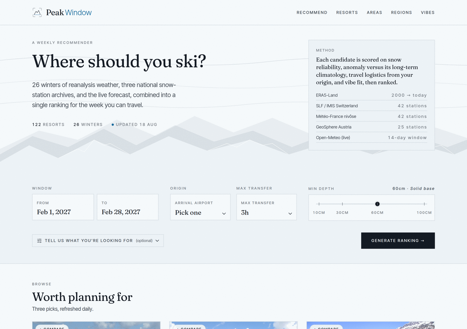
So I built peakwindow.io. You tell it when you want to go and which Alpine airport you’re flying into, and it ranks 122 European resorts on snow reliability, travel friction, size, and fit - built on decades of weather reanalysis and mountain station observations.
Tip
TL;DR: peakwindow.io is a read-optimised system built as two codebases that never speak to each other. A Python pipeline pre-computes every number the site will ever show into a single SQLite file; a Ruby web app reads that file and does no weather maths at all. This post is a tour of the project: what it does, where the data comes from, and how it’s put together.
Those two questions are worth pulling apart, because they need different data:
Both questions go through the same form and come back as the same ranked list. The difference is which signals dominate, decided by how close your dates are to today. A resort card shows both facts side by side - “snow-sure in 78% of years, and this season it’s running at the 92nd percentile of its own history” - rather than blending them into a single score. They’re different facts, and they read better as two numbers.
PeakWindow is split down the middle:
They share no code, no service, no queue, and no database server. The entire contract between them is one file: resorts.db, a SQLite database written by Python and opened read-only by Ruby. Here’s the whole system on one page:
The bottom half of that diagram - the object storage and the boot-pull - comes later; the place to start is the file in the middle.
The design is read-optimised, and that’s the pattern everything else follows. The site’s workload is almost entirely reads: every chart, percentage, and badge is a pre-computed projection, built by the pipeline before anyone asks for it. At request time the web app runs SELECTs over a few thousand rows and some light arithmetic across 122 resorts - no weather maths in the request path. The heavy lifting (aggregating 26 winters of hourly reanalysis into weekly probabilities) happens in the pipeline, on a schedule.
Once you accept that the data is frozen at build time and the app never writes a row, a shared database server stops making sense - there are no concurrent writers to coordinate. What’s left is a file-distribution problem, and SQLite is a good file format for it: greppable with sqlite3, diffable, openable in a notebook, and supported natively by both Python’s stdlib and Ruby’s Sequel.
That’s not an abstract benefit - the production artefact answers questions directly:
$ sqlite3 resorts.db \
    "SELECT iso_week, p_ge_60cm, hs_median_cm FROM climatology_weekly
     WHERE resort_id = 'zermatt' AND iso_week IN (51, 5, 9)"
iso_week  p_ge_60cm  hs_median_cm
--------  ---------  ------------
5         1.0        164.3
9         1.0        169.3
51        0.88       115.8
Zermatt clears a 60 cm base in 88% of winters at Christmas (week 51), and in every winter on record by February. Those columns are what the rest of this post is about.
Having Ruby read the pipeline’s parquet files directly was the other option, but pandas idioms (dtypes, NA semantics) leak across the language boundary and become the de-facto schema. Instead, the schema is a single schema.sql file, treated as source code and loaded verbatim by both sides: Python’s publisher recreates every table from it on each run, and the Ruby test suite loads the same file into an in-memory database. A schema change is a change to one file, with a publisher update and a reader update in the same patch.
A useful side effect: schema migrations don’t exist. The pipeline drops and rebuilds the whole database every run, so there’s never old data in the wrong shape to migrate.
The pipeline’s job is synthesis, so it pulls from a range of sources:
Each source gets its own ingestor, everything lands as daily-granularity parquet (ski conditions are a daily phenomenon; hourly data is aggregated on the way in), and a Snakefile is the single source of truth for what depends on what. A ski CLI wraps the lot, and every stage writes to an append-only run ledger, so “which files exist and where did they come from” is a query rather than guesswork.
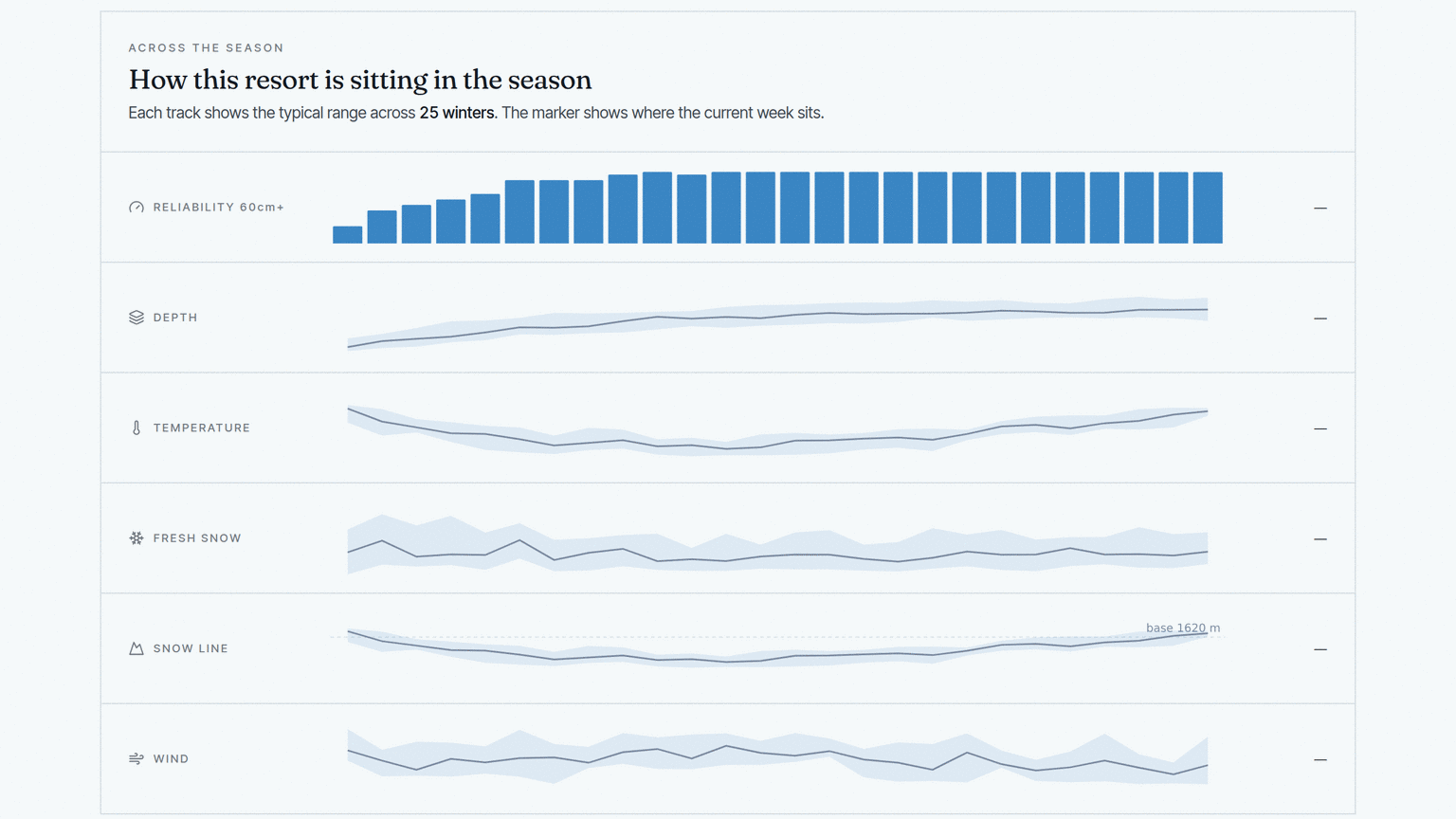
The core artefact is a weekly climatology table: one row per resort per ISO week, aggregated across every winter on disk. The headline column is an exceedance probability - the fraction of years in which that week’s snow depth cleared a threshold. When the site says a resort is “snow-sure”, what it means precisely is “in 78% of the last 26 winters, this week had at least 30 cm of settled base”. Alongside it sit the median depth and the 20th/80th percentiles - the lean-year floor and the bumper-year ceiling - because a single average hides exactly the thing a skier wants to know, which is how bad the bad years get.
On a resort’s page, that table renders as season tracks - reliability, depth, temperature, fresh snow, snow line, and wind, each showing the typical range across every winter on record, with a marker for where the current week sits:
The live overlay is an anomaly percentile: where the resort’s current snow depth ranks against its own history for this same week of the year. It’s a percentile rank rather than a z-score because Alpine snow distributions are skewed - occasional monster years, a long tail of dry ones - and a z-score against a non-Gaussian distribution misleads. “92nd percentile” also has the advantage of being explainable in one sentence.
On top of those sit a family of smaller projections, each its own pipeline stage: a five-tile snow quality panel (freeze-thaw cycles, days since fresh snow, whether the snowpack is holding, the altitude of the snow line, wind scouring), long-term trend analysis per resort using Mann-Kendall tests with Sen’s slope, and terrain and activity labels derived from OpenSkiMap geometry.
The scoring itself is a straightforward weighted blend:
| Signal | Weight | What it measures |
|---|---|---|
| Snow | 0.40 | Reliability (exceedance probability) blended with typical depth |
| Travel | 0.20 | Ground transfer time from your arrival airport |
| Vibe | 0.15 | Overlap with curated tags - scene, character, budget, setting |
| Size | 0.10 | Log-scaled piste-km of the linked area (the 3 Vallées count as the 3 Vallées) |
| Terrain | 0.10 | Learner-friendly through expert / glacier labels |
| Activity | 0.05 | Terrain parks, cross-country, tobogganing |
The founding principle here was climatology first, ML later. A well-built lookup table of “probability of good snow, given resort and week” beats a fancy model for a v1, is explainable on the page, and was shippable in weeks. A trained model could slot in later; it isn’t blocking anything.
One note on data honesty: the wind tile. Swiss resorts read wind from SLF stations at piste elevation - real anemometers, real numbers. Everyone else falls back to ERA5-Land, whose 9 km cells smooth ridge winds down by a factor of four to seven. Chamonix reading “1 m/s” is a smoothing artefact; Zermatt reading “8 m/s” is reality. Rather than pretending the two are comparable, the asymmetry is documented and the sourcing is visible in the panel.
The Ruby side is small, because the architecture lets it be. It’s a server-rendered Roda app with Phlex components for the views - plain Ruby classes that take their data through the constructor, no ERB in sight. Domain objects (Recommendation, ResortDetail, Comparison…) wrap the query-plus-presentation logic so the routes stay thin, and Stimulus handles the light client-side behaviour with no bundler and no build step. Chart.js draws the per-resort climatology and season charts from inline JSON.
I did consider Rails and ViewComponent - it’s the toolbox I’ve spent a career in - but ViewComponent requires Rails, and Rails brings a great deal of machinery for an app whose database is read-only and whose state lives in a URL. Phlex gives me the same “components as objects with explicit inputs” pattern at a fraction of the dependency weight. The whole thing deploys to Fly.io as one container with the SQLite file inside it: zero stateful infrastructure.
The first release shipped with resorts.db baked straight into the Docker image - a deliberate choice: the deploy is a single self-contained artefact, and the app can always boot with something sensible to serve. The climatology is happy being a few months old, but the realtime layer - anomaly badges, snow-quality panel, avalanche outlook - is only worth having if it’s current. So the plan was two phases: bake it in first, then layer a scheduled refresh on top, with the baked-in copy becoming what it is today - the fallback.
The constraint in phase two was that a scheduled job can’t simply “run the pipeline in CI”: the pipeline’s working state - the accumulated parquet tree - lived only on my machine, and a fresh checkout has nothing to rebuild from. Moving the refresh off the laptop first meant moving the canonical data off the laptop. So the data tree now lives in object storage (Tigris, Fly’s S3-compatible offering, which the app was already using), and two scheduled GitHub Actions jobs keep it current:
resorts.db.The split matters: the 26-winter climatology barely changes, and rebuilding it daily would burn hours of Copernicus queue time to reproduce the same numbers. Matching work to cadence keeps the daily job fast and light.
On the serving side, the app boot-pulls the latest database from the bucket, verifies it against a published SHA-256 manifest, and falls back to the image-baked copy if anything at all goes wrong. After each publish, the job restarts the Fly machine - refresh by process restart, not in-process hot-swap, because a process that only ever opens its database once at boot is a process with a whole class of concurrency bugs designed out of it.
The failure modes all land the same way. Object storage unreachable at boot? The baked-in database serves. An upstream weather source down during a run? That one table isn’t refreshed and yesterday’s data stands. A scheduled job fails outright? No publish happens and the site keeps serving the previous build. Every failure degrades to “slightly stale”, and none of them can take the site down. For a side project that has to survive weeks of my inattention, stale-but-serving is the right worst case.
I said the web app never writes a row, and that’s true of resorts.db - but there is one write path in the system: analytics events. The app publishes three events onto a small in-process bus - search.submitted, results.shown, and resort.clicked - each validated against a JSON Schema and wrapped in an envelope carrying an event id, timestamp, anonymous visitor id, and app version.
A background subscriber batches them up and appends them to Tigris as NDJSON objects - the same object storage the pipeline uses, in a separate bucket from the database. The write path is deliberately fire-and-forget: a background thread flushes every 50 events or 30 seconds, the queue drops events rather than ever blocking a request, and storage errors are counted and logged, never raised. Analytics should never be the reason a page is slow.
The point of collecting them is the feedback loop. The bucket is a plain pile of JSONL that can be analysed later: which weeks people search for, which resorts get clicked given the ranking they were shown. Right now data flows one way, pipeline to app - the events flow the other way, and at some point they can feed back into the scoring. If people consistently click past the top result for a particular kind of search, that’s a signal the weights are wrong.
The site is live at peakwindow.io, and it’s now the first thing I open when we start talking about next winter. There are loose threads. French resorts are climatology-only in season - Météo-France publishes its station archive yearly, so there’s nothing current to compute an anomaly against - which is why Swiss cards get the “having a great week” badge and French ones don’t, yet. The anomaly signal is source-agnostic, so adding a live French feed is wiring rather than rewriting. And the snow-quality tiles are slice one of three: the raw indicators exist, and a categorical state (“powder / packed / icy / spring”) plus a composite quality score are downstream compute on the same rows.
It’s been a satisfying thing to build: a data project whose entire production surface is one SQLite file, and a web app that deliberately does very little. If you’re planning a trip this winter, give it a go - and if it tells you your favourite week is only snow-sure in 40% of years, don’t shoot the messenger. That’s 26 winters of data talking.